Admin components
© 2015 The New York Times Company.
A custom flavor of Bootstrap that serves as the scaffolding for admins at The New York Times.
Adcom ships with compiled development and minified versions of adcom.css, along with a .map file, which is ready for inclusion on your webpages. The current version uses Bootstrap v3.3.4.
Our source .less files are available in the source code; see Development for information about customizing them yourself.
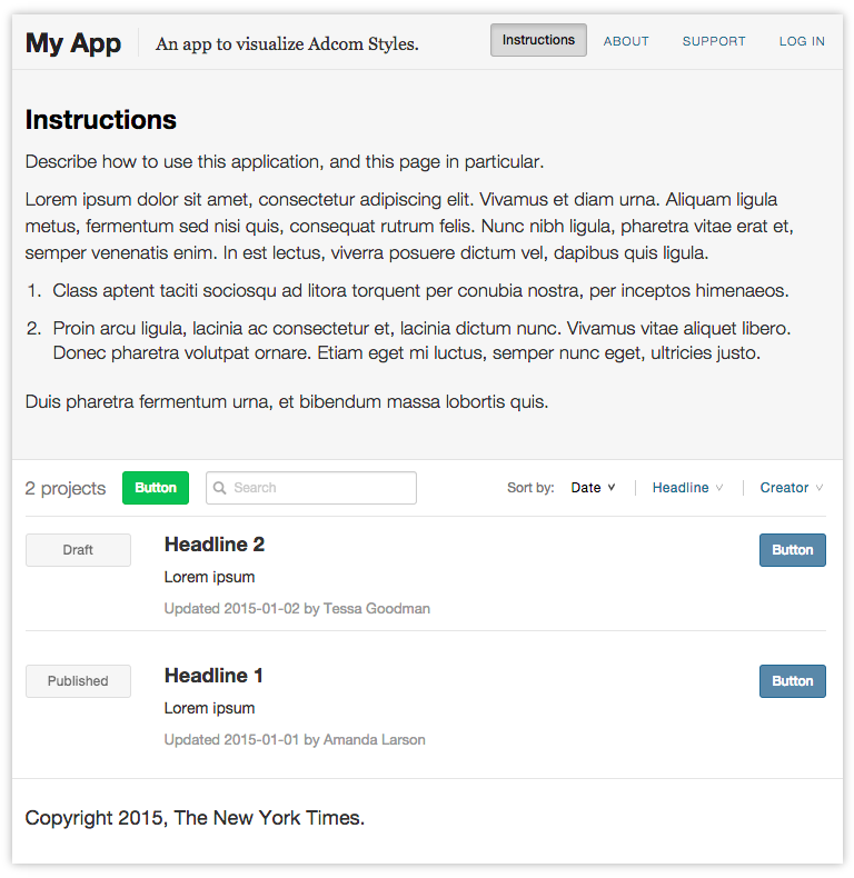
The best introduction we can give to the Adcom styles is simply to see it in action. View an example boilerplate index page here.
Several of the componets, such as the navbars, instructions drawer, and styles for rendering items in a central list, are opinionated in their design, to be consistent, intuitive, and minimalistic in the complexity of actions they encourage.
We encourage pages to include the following:
In practice, most of the pages we produce are some sort of index page. Having a general style that highlights primary actions for a reader to take not only save development time, but gives readers a more familiar environment and encourages developers to keep the page's workflow simple and streamlined.
While the scaffolding above helps our admins be consist and clear, the individual components are there mainly to save time.
We've tried to encourage several things in our designs:
We use two separate navigation bars: one that is consist across tools, and includes universal features likes links to support and information. Another another that is specific to the tool, and may vary freely by page.
<div class="navbar navbar-default navbar-primary">
  <div class="container">
    <div class="navbar-header">
      <a class="navbar-brand">App Name</a>
    </div>
    <ul class="nav navbar-nav navbar-left">
      <li class="navbar-summary"><span>Description.</span></li>
    </ul>
    <ul class="nav navbar-nav navbar-right navbar-bits">
      <li class="navbar-form" data-toggle="collapse" href="#page-instructions">
        <button type="button" class="btn btn-sm btn-muted" data-toggle="button">
          Instructions
        </button>
      </li>
      <li><a href="#">About</a></li>
      <li><a href="#">Support</a></li>
      <li><a href="#">Log in</a></li>
    </ul>
  </div>
</div>
<div class="navbar navbar-default">
  <div class="container">
    <div class='btn btn-sm btn-success navbar-btn navbar-left'>
      Button
    </div>
    <form class='navbar-form navbar-left form-inline'>
      <div class='form-group form-group-sm glyphicon-input'>
        <input class='form-control input-sm' data-filter='headline,author' data-target='#myList' data-trigger='keyup' placeholder='Search' style='min-width: 190px'>
        <i class='glyphicon glyphicon-search'></i>
      </div>
    </form>
    <ul class='nav navbar-nav navbar-right navbar-sort'>
      <li><span>Sort by:</span></li>
      <li>
        <a class='sort-control sort-descending' data-sort='updated_at' data-target='#myList' href='#'>Date Updated</a>
      </li>
      <li>
        <a class='sort-control' data-sort='headline' data-target='#myList' href='#'>Headline</a>
      </li>
    </ul>
  </div>
</div>
In general, forms should be rendered inline in modals on the page with Form.js.
Use modals to:
form_for in favor of JSON-based serialization (with .form('show'))Forms should use native validation where possible to display errors, and use the HTML5 validations API to configure custom error messages.
<form class="form-horizontal">
<div class="modal-header">
<button type="button" class="close" data-dismiss="modal"><span>×</span></button>
<h2 class="modal-title">Create New List</h2>
</div>
<div class="modal-body">
<div class="form-group">
<label class="control-label">Headline</label>
<div class="control-input">
<input class="form-control" placeholder="Headline">
</div>
</div>
<div class="form-group">
<label class="control-label">Leadin</label>
<div class="control-input">
<textarea class="form-control" placeholder="Leadin"></textarea>
</div>
</div>
<div class="form-group">
<label class="control-label">Tone</label>
<div class="control-input">
<select class="form-control">
<option selected value="default">Default</option>
<option value="feature">Feature</option>
</select>
</div>
</div>
<div class="form-group">
<label class="control-label">Creator</label>
<div class="control-input">
<input class="form-control" placeholder="Creator">
</div>
</div>
<div class="modal-footer">
<input type="button" class="btn btn-link btn-lg" value="Cancel">
<input type="button" class="btn btn-primary btn-lg" value="Create List" data-loading-text="Submitting...">
</div>
</form>
The primary submit button on a form should use the btn-primary class; other buttons should tend to use btn-link for de-emphasis.
Use the default validation states provided by Bootstrap.
We use a consistent layout for general index pages, and divide the rows for individual resources into three sections:
<div class="list list-bordered">
  <div class="list-item">
    <div class='content-labels'>
      <span class="btn btn-sm btn-block btn-muted disabled">Label</span>
    </div>
    <div class='content-primary'>
      <h4>Title</h4>
      <p>Description</p>
      <p class="content-metadata">
        Updated <span>TKTK</span>
        by <span>TKTK</span>
      </p>
    </div>
    <div class='content-actions text-right'>
      <button class="btn btn-sm btn-primary">Button</button>
    </div>
  </div>
</div>
List elements should have at most one primary button. Elements that link to a detail view should have that link be the primary link, right-most inside the element, in addition to the primary heading tag of the item being a link to it as well. Avoid turning the entire item into a link.
Adcom includes some built-in classes for styling sort triggers and search fields.
Filtering should happen client-side wherever possible.
<div class="navbar navbar-default">
  <div class="container">
    <ul class='nav navbar-nav navbar-sort navbar-left'>
      <li><span>Sort by:</span></li>
      <li>
        <a class='sort-control sort-descending' data-sort='updated_at' data-target='#myList' href='#'>Date Updated</a>
      </li>
      <li>
        <a class='sort-control' data-sort='headline' data-target='#myList' href='#'>Headline</a>
      </li>
      <li>
        <a class='sort-control' data-sort='author' data-target='#myList' href='#'>Creator</a>
      </li>
    </ul>
  </div>
</div>

<div class="navbar navbar-default">
  <div class="container">
    <ul class="nav navbar-nav navbar-left">
      <li class="navbar-form">
        <form class="form-inline">
          <div class="form-group form-group-sm glyphicon-input">
            <input class="form-control input-sm" placeholder="Placeholder">
            <i class="glyphicon glyphicon-search"></i>
          </div>
        </form>
      </li>
    </ul>
  </div>
</div>
Adcom doesn't define custom styles for pagination, and in practice we avoid using it in admins. Instead, infinite scroll and additional filters as needed are preferable.
A default loading state is included with Adcom that can be applied to lists with the loading class. This is useful for lists whose items are ajaxed in, or for inline lists that may take a split second to initialize. The loading class is removed when the list is finally rendered. The value of the list's data-loading-text will be used as a loading message.
<div class="list loading" data-loading-text="Loading items"></div>
Based on Snackbars from Google's Material Design spec, messages are meant to provide brief, optionally actionable, feedback to readers. Google's usage guidelines are the foundation of our usage rules. They can be made interactive using Message.js.
For destructive actions, messages should include an undo command. Messages should not stack, and Message.js allows only one to be present at a time; new messages forcibly replace older messages.
<div class="message fade in">
  Message sent
  <a href="#">Undo</a>
</div>
Dialogs are constructed identically to messages, but with an extra message-dialog class. They differ from Messages in that they are meant to stop the reader's action, and require some sort of interaction. They are more loosely based on Google's Dialogs. Cancel should always be an explicit option.
<div class="message message-dialog fade in">
  <h4>You must be logged in to continue</h4>
  <p>Exporting this article requires that you be logged into the CMS.</p>
  <a href="#" data-dismiss="message">Cancel</a>
  <a href="#">Login</a>
</div>
For dialogs that demand an external action by the user (such as logging in), a retry option should be provided if possible to avoid repetition of the workflow.
Both Messages and Dialogs can be modified with the message-sm and message-lg classes to change their widths. Include the fade class to animate the show / hide transition.
Buttons work the same way as they do in Bootstrap, but Adcom has modified some of the colors and added an additional class, btn-muted.
<p>
  <button type="button" class="btn btn-default">Default</button>
  <button type="button" class="btn btn-muted">Muted</button>
  <button type="button" class="btn btn-primary">Primary</button>
  <button type="button" class="btn btn-success">Success</button>
  <button type="button" class="btn btn-info">Info</button>
  <button type="button" class="btn btn-warning">Warning</button>
  <button type="button" class="btn btn-danger">Danger</button>
  <button type="button" class="btn btn-link">Link</button>
</p>
<p><button type="button" class="btn btn-default btn-lg">Large button</button></p>
<p><button type="button" class="btn btn-default">Default button</button></p>
<p><button type="button" class="btn btn-default btn-sm">Small button</button></p>
<p><button type="button" class="btn btn-default btn-xs">Extra small button</button></p>